纯 CSS 火箭发射与返回顶部效果实现
- 前端工程
- 时间:2026-06-09 11:28:46
- 192 人已阅读
简介使用一个完整 index.html 演示阅读进度条、纯 CSS 火箭、尾焰动画与平滑返回顶部交互。
纯 CSS 火箭发射与返回顶部效果实现
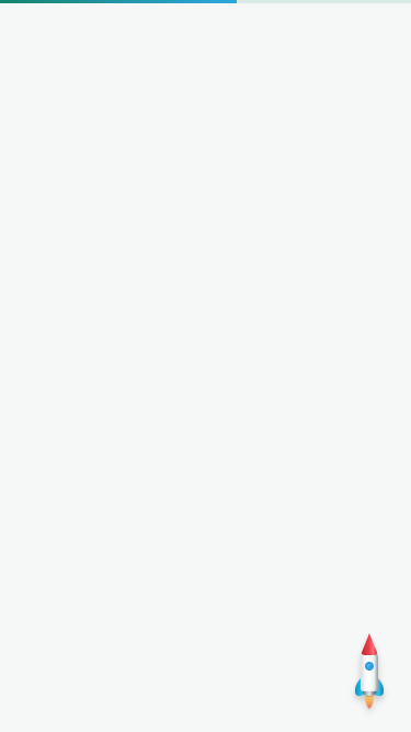
最近给博客补充了全站阅读进度条和返回顶部功能。为了让交互更有趣,返回顶部入口没有使用普通圆形箭头,而是用 HTML 与 CSS 绘制了一枚会发射的火箭。
这个效果包含阅读进度计算、滚动后显示火箭、尾焰呼吸动画、点击发射动画和平滑返回顶部。整个演示不依赖图片,也不需要第三方动画库。
实现思路
- 页面滚动超过一定距离后显示右下角火箭。
- 火箭由尖头、机身、舷窗、左右尾翼、尾部机罩和尾焰组成。
- 点击后为按钮增加发射状态,让火箭垂直飞出视口,同时平滑滚动到顶部。
- 发射结束后移除动画状态,等待下一次使用。
完整 index.html 演示
下面只有一个完整代码块,可以保存为 index.html 后直接在浏览器中运行。
<!DOCTYPE html>
<html lang="zh-CN">
<head>
  <meta charset="UTF-8">
  <meta name="viewport" content="width=device-width, initial-scale=1.0">
  <title>CSS 火箭发射返回顶部</title>
  <style>
    * { box-sizing: border-box; }
    html { scroll-behavior: smooth; }
    body {
      margin: 0;
      color: #333;
      background: #f5f8f7;
      font: 16px/1.8 Arial, "Microsoft YaHei", sans-serif;
    }
    .page {
      width: min(900px, calc(100% - 32px));
      min-height: 2400px;
      margin: 0 auto;
      padding: 56px 0;
    }
    .page section {
      margin-bottom: 28px;
      padding: 24px;
      background: #fff;
      border: 1px solid #e7eeea;
    }
    .reading-progress {
      position: fixed;
      top: 0;
      left: 0;
      z-index: 9999;
      width: 100%;
      height: 3px;
      background: rgba(22, 133, 107, .12);
      pointer-events: none;
    }
    .reading-progress span {
      display: block;
      width: 0;
      height: 100%;
      background: linear-gradient(90deg, #16856b, #2ea7e0);
      transition: width .12s ease;
    }
    .back-top {
      position: fixed;
      right: 26px;
      bottom: 34px;
      z-index: 900;
      display: none;
      width: 44px;
      height: 70px;
      padding: 0;
      border: 0;
      background: transparent;
      box-shadow: none;
      cursor: pointer;
      overflow: visible;
      appearance: none;
    }
    .back-top.is-visible { display: block; }
    .rocket {
      position: absolute;
      left: 50%;
      top: 4px;
      width: 34px;
      height: 56px;
      transform: translateX(-50%);
      transform-origin: 50% 70%;
      filter: drop-shadow(0 4px 3px rgba(0, 0, 0, .18));
      transition: transform .18s ease, filter .18s ease;
    }
    .back-top:hover .rocket {
      transform: translateX(-50%) translateY(-3px);
      filter: drop-shadow(0 7px 6px rgba(0, 0, 0, .22));
    }
    .rocket-nose {
      position: absolute;
      z-index: 3;
      left: 9px;
      top: -6px;
      width: 16px;
      height: 20px;
      border-radius: 50% 50% 4px 4px;
      background: linear-gradient(90deg, #b62331, #ed3e4b 48%, #ff7079 72%, #b92330);
      clip-path: polygon(50% 0, 100% 100%, 0 100%);
    }
    .rocket-body {
      position: absolute;
      z-index: 2;
      left: 9px;
      top: 9px;
      width: 16px;
      height: 38px;
      border-radius: 8px 8px 3px 3px;
      background: linear-gradient(90deg, #c7cdcf, #f2f4f5 22%, #fff 50%, #eef1f2 76%, #bcc3c6);
      box-shadow: inset 2px 0 2px rgba(255, 255, 255, .35), inset -2px 0 2px rgba(0, 0, 0, .18);
    }
    .rocket-window {
      position: absolute;
      z-index: 4;
      left: 13px;
      top: 20px;
      width: 8px;
      height: 8px;
      border: 2px solid #2b9ee3;
      border-radius: 50%;
      background: #2b9ee3;
      box-shadow: inset 1px 1px 1px rgba(255, 255, 255, .28);
    }
    .rocket-fin {
      position: absolute;
      z-index: 1;
      top: 34px;
      width: 11px;
      height: 17px;
      background: linear-gradient(90deg, #168bb9, #29c4ef 58%, #147da8);
    }
    .rocket-fin-left {
      left: 4px;
      border-radius: 9px 2px 3px 7px;
      transform: skewY(-28deg);
    }
    .rocket-fin-right {
      right: 4px;
      border-radius: 2px 9px 7px 3px;
      transform: skewY(28deg);
    }
    .rocket-nozzle {
      position: absolute;
      z-index: 1;
      left: 11px;
      top: 43px;
      width: 12px;
      height: 8px;
      border-radius: 2px 2px 5px 5px;
      background: linear-gradient(90deg, #596166, #b6bdc0 28%, #e1e5e6 52%, #929a9e 76%, #4c5459);
      box-shadow: inset 0 1px 1px rgba(255, 255, 255, .45), 0 1px 1px rgba(0, 0, 0, .18);
    }
    .rocket-flame {
      position: absolute;
      z-index: 0;
      left: 12px;
      top: 49px;
      width: 10px;
      height: 20px;
      border-radius: 45% 45% 0 0;
      clip-path: polygon(16% 0, 84% 0, 100% 30%, 82% 64%, 62% 88%, 50% 96%, 38% 88%, 18% 64%, 0 30%);
      background: linear-gradient(180deg, #ffd45c, #ff9d32 48%, #ef5a24 82%, rgba(239, 90, 36, 0));
      filter: drop-shadow(0 2px 2px rgba(239, 90, 36, .32));
      transform-origin: 50% 0;
      animation: idle-flame .24s ease-in-out infinite alternate;
    }
    .back-top.is-launching {
      pointer-events: none;
      animation: rocket-launch 1.05s cubic-bezier(.3, .68, .28, 1) both;
    }
    .back-top.is-launching .rocket {
      animation: rocket-shake .12s ease-in-out infinite alternate;
    }
    .back-top.is-launching .rocket-flame {
      height: 46px;
      animation: launch-flame .1s ease-in-out infinite alternate;
    }
    @keyframes rocket-launch {
      0% { transform: translateY(0); opacity: 1; }
      12% { transform: translateY(10px); opacity: 1; }
      100% { transform: translateY(calc(-100vh - 120px)); opacity: 0; }
    }
    @keyframes idle-flame {
      from { transform: scaleX(.82) scaleY(.72); opacity: .72; }
      to { transform: scaleX(1) scaleY(1); opacity: 1; }
    }
    @keyframes launch-flame {
      from { transform: scaleX(.78) scaleY(.8); filter: brightness(1); }
      to { transform: scaleX(1.12) scaleY(1.08); filter: brightness(1.24); }
    }
    @keyframes rocket-shake {
      from { transform: translateX(-51%) rotate(-1deg); }
      to { transform: translateX(-49%) rotate(1deg); }
    }
    @media (max-width: 768px) {
      .back-top { right: 16px; bottom: 18px; }
    }
  </style>
</head>
<body>
  <div class="reading-progress" aria-hidden="true"><span id="progress-bar"></span></div>

  <main class="page">
    <section>
      <h1>纯 CSS 火箭发射返回顶部</h1>
      <p>向下滚动页面,右下角会出现火箭。点击火箭后,它会拉长尾焰并飞向页面顶部。</p>
    </section>
    <section><h2>阅读内容一</h2><p>这里是用于演示页面滚动的占位内容。</p></section>
    <section><h2>阅读内容二</h2><p>阅读进度条会根据整个文档的滚动距离更新。</p></section>
    <section><h2>阅读内容三</h2><p>返回顶部按钮本身透明,只显示由 CSS 绘制的火箭。</p></section>
  </main>

  <button type="button" class="back-top" id="back-top" aria-label="返回顶部">
    <span class="rocket" aria-hidden="true">
      <span class="rocket-nose"></span>
      <span class="rocket-body"></span>
      <span class="rocket-window"></span>
      <span class="rocket-fin rocket-fin-left"></span>
      <span class="rocket-fin rocket-fin-right"></span>
      <span class="rocket-nozzle"></span>
      <span class="rocket-flame"></span>
    </span>
  </button>

  <script>
    (function () {
      var button = document.getElementById('back-top');
      var progressBar = document.getElementById('progress-bar');
      var launching = false;

      function update() {
        var top = window.pageYOffset || document.documentElement.scrollTop || 0;
        var height = Math.max(document.documentElement.scrollHeight - window.innerHeight, 1);
        progressBar.style.width = (Math.min(1, top / height) * 100).toFixed(2) + '%';
        button.classList.toggle('is-visible', top > 360 || launching);
      }

      button.addEventListener('click', function () {
        if (launching) return;
        launching = true;
        button.classList.add('is-visible', 'is-launching');
        window.scrollTo({ top: 0, behavior: 'smooth' });

        window.setTimeout(function () {
          launching = false;
          button.classList.remove('is-launching');
          update();
        }, 1100);
      });

      window.addEventListener('scroll', update, { passive: true });
      window.addEventListener('resize', update);
      update();
    })();
  </script>
</body>
</html>
小结
将结构、样式和交互放进一个演示文件,方便快速理解和复制。实际项目中可以再把公共结构放入页脚组件,把 CSS 与 JavaScript 拆分到公共静态资源中,这样首页、文章列表、留言页和文章详情页都能共享同一套效果。
下一篇:返回列表
文章评论
暂无评论,来写第一条吧。